I spend a lot of time thinking about user experience in websites, experiments and conversion journeys, but recently I realised there was one part of my own site that I had barely questioned at all: the blog. I had written a long article about a WordPress plugin I built called Form Relay, and although I was happy with the content, something about the finished page still felt wrong. The writing made sense, the structure was logical and the typography was not obviously broken, but the whole thing still felt scattered and slightly exhausting to look at.
That bothered me because the whole purpose of writing something is for people to actually want to read it. Instead of immediately blaming the copy, I started looking at the article itself as an interface. That small shift in thinking changed the entire direction of the problem.
The article was readable, but it did not feel easy to read
My first instinct was to focus on the writing itself. Some paragraphs were too short, a few punchy sentences had been given their own lines and the page had started to drift towards that familiar social-media style where every thought gets separated for dramatic effect. That can work in short posts, but in a long article it made the content feel fragmented rather than easy to consume.
So I started by fixing the copy. Related thoughts were kept together, paragraphs were allowed to breathe properly and short standalone lines were reserved for moments where they genuinely added emphasis. That immediately improved the article, but I still had the same underlying reaction when I looked at the page as a whole: there was simply a lot of it.
That was when I realised the issue was not just readability in the traditional sense. The text itself was becoming easier to read, but the page still looked like a long commitment before the reader had even started.
The problem was bigger than typography
There is plenty of sensible advice around designing readable long-form content. Keep the reading width under control, use comfortable line-height, avoid overly wide paragraphs and make sure headings create a clear hierarchy. I experimented with all of those things and they did help, but they only solved part of the problem.
The page still had one major UX issue: the reader could see that they were entering a large continuous document. Even if each individual paragraph was perfectly readable, the full page still communicated a fairly simple message: there is a lot of scrolling ahead of you.
That psychological side of readability is easy to miss. A reader does not inspect your CSS and decide whether the article is technically well designed. They glance at the page and immediately form an impression of how much effort it is going to require. If the answer feels like “quite a lot”, there is a good chance they will leave before your beautifully tuned typography has a chance to help.
I started thinking about scroll fatigue
The more I looked at the article, the more I realised that scrolling itself was not really the problem. The issue was that there was no strong sense of progress. The reader could finish one section, move into another and then another, but visually it was all part of one continuous stream.
The H2 headings created some separation, but they were still only acting as typography. From the interface’s point of view, every section existed on the same enormous page. That made me wonder whether those headings could do more than simply make text bigger.
If the content was already structured into meaningful sections, why not let the interface acknowledge that structure too?
That is when ebooks started making sense
Ebooks handle long content very differently from a normal web page. A book can contain tens of thousands of words, but the reader is never confronted with the visual weight of the entire thing at once. They deal with one manageable piece of content, while the interface quietly keeps track of where they are.
I did not want to literally recreate a Kindle inside my website. Fake paper textures, page-turn animations and fixed-height pages would have been an excellent way to solve one UX problem by creating several more. What interested me was the principle behind the experience: only ask the reader to deal with one meaningful chunk at a time.
For my blog, that chunk was already obvious. Each H2 naturally represented a new idea, so it made sense to treat those sections as chapters.
Turning H2 sections into chapters
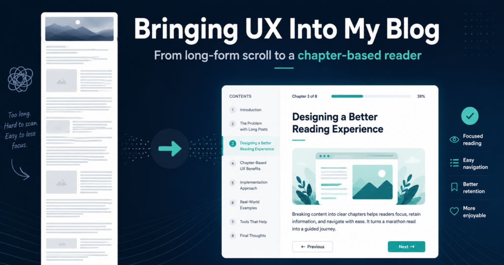
The new approach was to treat the introduction and every H2 section as separate parts of the reading experience. Instead of presenting the entire article in one continuous page, the interface could show one chapter at a time and let the reader move forwards or backwards when they were ready.
That immediately changed the perceived size of the article. Instead of seeing a huge wall of content, the reader might see “Chapter 3 of 8”, one heading and a few paragraphs. The amount of writing had not changed at all, but the experience of reading it had.
This also created some useful opportunities around navigation. A contents menu could let the reader jump directly to a chapter, progress indicators could show how far through the article they were and Previous or Next controls could make the journey feel deliberate rather than endless.
Keeping the article as normal HTML
One thing I was keen to avoid was making the content dependent on JavaScript. I did not want to create a custom article system where every post had to be manually configured or where the writing stopped making sense if the enhancement failed.
The underlying article therefore remains completely normal HTML. The headings, paragraphs, code blocks and links are all still present in the page exactly as they would be in a traditional blog post. JavaScript simply identifies the existing H2 structure and enhances it into the chapter-based reader.
That gives the feature a useful escape route too. If I decide in six months that chapter mode was a terrible idea, I can remove the enhancement and the content simply returns to being a normal scrolling article. There is no migration, no rewriting and no archaeological expedition through old Gutenberg content trying to work out what past me was thinking.
Giving the reader a choice
I also did not want the chapter view to become another example of a website deciding it knows better than the person using it. Some people will prefer reading one section at a time, but others will want the full article visible so they can scan it, search within the page or jump around freely.
The cleanest solution was to offer both. Chapter View becomes the more focused experience, while Full Article keeps the familiar long-form layout. Switching between them does not need to reload the page, and the reader can choose whichever mode better suits the way they want to consume the content.
That choice feels important because the goal of the experiment was to reduce friction, not simply replace one rigid reading model with another.
The H2 became part of the interface
This is probably the part of the experiment I like most. Previously, an H2 mostly existed for content hierarchy and presentation. It told the reader that a new topic was beginning and gave the page some visual structure.
With the chapter model, the H2 also becomes behavioural. It defines where one chapter ends and the next begins, which means the structure of the writing and the structure of the interface are working together rather than being treated as separate concerns.
It also means the system scales naturally. I do not need to create chapter settings in WordPress or manually define boundaries for every article. If the writing is structured properly, the interface can understand it automatically.
What started as paragraph spacing became a UX problem
The slightly ridiculous part of this whole experiment is where it started. My original complaint was basically that the paragraphs on my blog looked a bit scattered. I thought I might need to tweak some margins, adjust the line-height and call it a day.
Instead, I went from paragraph spacing to content width, from content width to scroll fatigue, from scroll fatigue to ebooks, and eventually ended up redesigning the entire reading model of the blog. A perfectly normal escalation for a developer.
That process reminded me of something I see all the time in UX work: the first thing you notice is not always the real problem. Sometimes it is just the symptom that points you towards something deeper.
Bringing CRO thinking into content
A lot of my work involves thinking about friction. Where does somebody hesitate? Where does a journey feel harder than it needs to be? What information should appear now, what can wait until later and how do we make the next action feel obvious?
Those questions usually come up around conversion journeys, experiments and interactive interfaces, but they apply surprisingly well to content too. A blog post still has a journey. Someone lands on the page, decides whether it looks worth reading, starts consuming the content, chooses whether to continue and eventually reaches the end.
If the interface makes that journey feel tiring before they have even started, then the quality of the writing might never get the chance to matter. That was the part I had been missing when I originally treated the blog as little more than a container for paragraphs.
Where I ended up
The final direction is a chapter-based reader built around the structure that already exists in the article. Long-form posts can be split automatically using their H2 headings, the reader can focus on one section at a time and the interface can provide progress, navigation and a contents view without changing the actual content.
The traditional full article remains available for anyone who prefers it, and the underlying HTML stays simple enough that the entire experience can fall back gracefully if JavaScript is unavailable. It feels like a much better fit for the kind of long-form technical writing I want to publish because the interface now supports the content instead of simply displaying it.
The biggest lesson for me was that a blog is not just a place where text lives. It is an interface for reading, and once I started treating it that way, the problem became much more interesting.
What started as me being mildly annoyed by paragraph spacing somehow ended with me building a chapter-based reading experience.
Which, in hindsight, is probably the most predictable developer outcome possible.