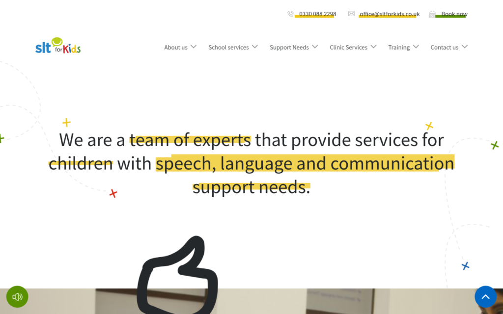

SLT for Kids is a nationwide specialist paediatric speech and language therapy service, supporting children across areas including speech, language, communication, voice and feeding.
When I worked with the team, the service had recently undergone a rebrand, but its website had not yet grown to reflect the breadth of what they offered.
The existing site was effectively a single landing page, leaving limited space to explain individual services, introduce the team or help parents understand what support might be right for their child.
My role was to turn that limited presence into a complete website that could better represent the organisation, make its services easier to understand and create clearer routes for parents and carers looking for support.
Building a website around the service
The biggest change was moving away from a single-page experience.
SLT for Kids offered support across a wide range of needs, and trying to communicate everything within one page made it difficult for users to understand the full extent of the service.
I developed the new website as a much broader multi-page platform, giving individual services and areas of expertise space to be properly explained.
This allowed visitors to explore the website based on what was relevant to them rather than having to work through one large page of information.
It also gave the organisation a much stronger foundation for adding new content as its services continued to grow.
Making complex information easier to navigate
For many visitors, arriving on the SLT for Kids website could be the beginning of trying to understand a problem they had not dealt with before.
That made clarity especially important.
The structure of the site was designed to help parents and carers move from understanding a particular area of support through to learning more about the service and ultimately getting in touch with the team.
Alongside the core service information, we introduced more detail about the people behind SLT for Kids, their expertise and the work they had already carried out.
Case studies and success stories also helped provide additional context around the type of support available and the difference therapy could make.
Accessibility as part of development
Accessibility was an important consideration throughout the build.
The website needed to work for a broad range of users and assistive technologies, so the development focused on producing a clear, responsive experience that could be navigated and understood regardless of device.
Particular consideration was given to how content would behave when used with technologies such as screen readers and text-to-speech software.
Rather than treating accessibility as something to add at the end of the project, it influenced how the site was structured and developed from the beginning.
Helping visitors find the right information
As the amount of content increased, finding a particular service or piece of information also became more important.
To support this, I implemented search functionality using Google’s search technology, allowing visitors to search across the website based on the information they were looking for.
This gave users another route into the site’s content, particularly where they might know the problem they wanted help with but not the name of the relevant service.
It was a relatively small piece of functionality, but one that became much more valuable as the website grew beyond its original single-page format.
Developing the rebrand
The project was also an opportunity to translate SLT for Kids’ new visual identity into a complete digital experience.
Working as a developer at Nuttersons, I was responsible for the end-to-end development of the site, taking the new brand and applying it consistently across responsive layouts, content templates and interactive elements.
The challenge was not simply reproducing the visual design. The new site needed to feel approachable and professional while still supporting a large amount of often detailed information.
That balance became an important part of how the finished website was structured.
The outcome
The project transformed SLT for Kids from a single landing page into a much more complete digital presence.
Visitors were given clearer routes into individual services, more information about the organisation and its specialists, improved ways of finding relevant content and more opportunities to make an informed enquiry.
For SLT for Kids, the new website provided a platform that more accurately reflected the scale of the service and gave the organisation room to grow beyond the limitations of its original site.
For me, it was an early example of how development decisions around structure, accessibility, content and user journeys can have just as much impact as the visual design itself.