
The Challenge
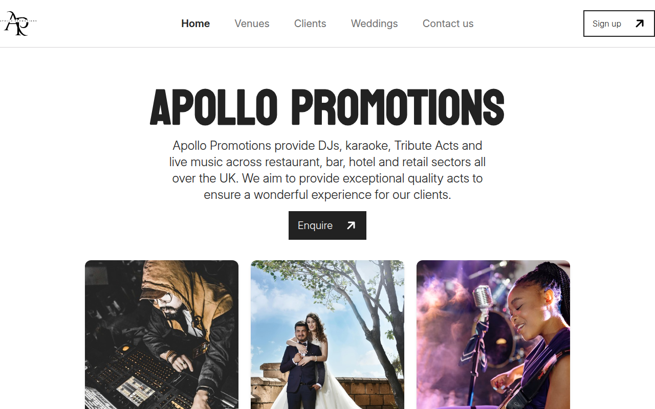
Apollo Promotions started as a new business idea from a client I had already worked with on Liverpool Guitar Lessons. The goal was to create a platform that could attract both musicians and venues, build confidence in the new brand and generate enquiries as the business grew.
Because the business was starting from scratch, one of the biggest challenges was the copywriting. There was very little existing material to work from, so I researched competitors to understand what musicians and venues expected to see, what services needed to be explained and where Apollo could stand out.
The Approach
I helped shape the colour palette, typography and wider visual identity around a modern, polished and premium direction. The messaging was kept personal, open and transparent so visitors could clearly understand what Apollo offered without vague promises or hidden expectations.
The site was designed and developed from scratch as a bespoke WordPress theme using Vite, Timber, Twig, Tailwind CSS and custom ACF fields. I also built tailored enquiry journeys for the two main audiences. Musicians are guided through a form focused on artist details such as their name, address, photo and whether they are a DJ or musician, while venues receive a more business-focused journey covering details such as their business information, address and venue type.
Clear calls to action throughout the site help direct each audience towards the most relevant route, while the wider site structure covers the business, services, musicians, venues and contact information without relying on an off-the-shelf page builder.
The Outcome
The finished website gave Apollo Promotions a complete platform to launch a new business direction, bringing the branding, messaging, service information and enquiry journeys together in one place. The contact forms were thoroughly tested before launch to make sure the most important conversion path was reliable.
The website remains in active use today. The ongoing focus is on helping the right musicians and venues discover the business through SEO, rankings and continued refinement of the site as more is learned about how people use it.
What I’d improve next
Looking back at the site, I am still really happy with the branding, typography and colour palette. The main area I would revisit is the amount of copy and how some of that content is presented.
I would look at breaking the more text-heavy sections into more bespoke, visual components that are easier to scan, moving further away from a traditional blog-style layout. It is the kind of project I could keep refining forever, but those changes would be a useful next step without losing the visual identity that still feels strong today.